Naturally we are drawn to different colours, when it comes to different aspects of life. We like bright colours when it comes to foods and drinks, we are all drawn to different ‘favourite’ colours and relate colours to all different things. Whether the use of colour is applied in marketing to capture attention or reflects your personality when it comes to your preference, it is all ultimately based on the psychology behind it.
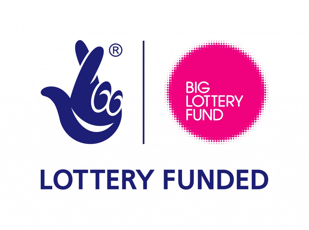
Navy
The colour navy reflects loyalty, control, success, sincere, communication and authoritative attributes, this colour is seen as very calming. Companies that have used this colour include the lottery logo which draws on the success element of the colour and facebook which touches on the communication.
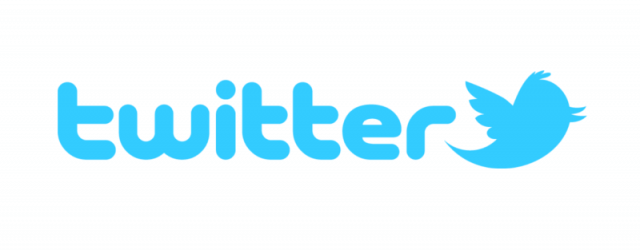
Blue
Blue is a very open colour that is also spiritual, controlled, ambitious and modern. This colour is reflected very well in tons of modern and technological brands such as intel, Blu-ray, Twitter, WordPress and Internet Explorer.
Green
Green is an earthy colour that represents life, growth, safety, clarity and prosperity. The body shop use green as their main logo colour which is complimentary of their animal friendly products. Other companies that use green include bp, which is slightly ironic as it provides earth damaging fuel but is also clever marketing as if gives an eco-friendly appeal to the brand.
Yellow
Yellow conveys positivity, intellect and energy, this bright colour is positive and inviting. Huge companies such as McDonalds and Ferrari use yellow as their main branding colour as it attracts and makes the brand look happy, elite and it stimulates positivity.
Orange
Orange is a vibrant, bright, summery colour that stems to freedom, impulse, extrovert and optimism. People that wear orange are often more brave and confident in their own taste and style, so this is very reflective of that type of character. This colour can be found on the Nickelodeon logo showing it is bold extraverted and fun.
Purple
Purple is seen as a hearty and creative colour that reflects modesty, originality and fantasy. Purple is also an age old colour that reflected wealth amongst Royals and the rich. This richness of the colour is used by Cadbury and Milka, which take on the richness.
Red
Red reflects power, ambition, strength and passion which brings energy and excitement. Red is a bold colour to wear and makes a statement which gives this colour a sense of power and leadership. Big companies that use red include Coca Cola, Virgin and Nintendo; all of which are hugely successful and strong companies.
Pink
Pink is renowned for being a ‘girls’ colour and with that it has more feminine connotations such as warmth, love, nurture and care. This is also used for more feminine companies such as Victoria Secret, Barbie and Cosmopolitan.
White
White represents freshness, hope, purity, simplicity and coolness. White is a very clean and minimal, as used for big brands such as Hugo Boss, Giorgio Armani and Rolls Royce.
Grey
Grey is balanced, neutral, secure and mature, this colour reflects an older age where conveys a wiser and more experienced tone. Companies that use grey logos include Lexus, Volkswagen and Swarovski, all of which have a branded impression of knowledge and being highly experienced in their own fields.

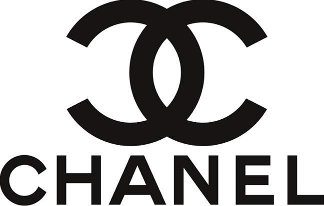
Black
Black shows sophistication, mystery, fear and power. This colour is used by huge fashion and beauty companies such as Chanel, Yves Saint Lauren and MAC as it has an element of mystery that attracts buyers to the brand but also retains a classic style of sophistication and power.