The Apple Company was founded by Steve Jobs, Steve Woznaik and Ronald Wayne. It fast earned the reputation of a tech giant with the iPhones gaining popularity by the day. Soon Apple became the most popular phone brand and its logo is easily recognized by everyone, wherever it is seen. Here its important to say that though the Apple logo has always remained the same but it has changed colors a couple of times.
The first Apple logo

The first Apple logo was designed by the co-founder of the company, Robert Wayne. The logo showed Issac Newton sitting under an apple tree, where he discovered the gravitational force. But this logo was replaced in the same year by the rainbow logo.
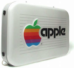
Rainbow Logo

Steve Jobs hired a graphic designer, Rob Janoff to design the logo. Steve Jobs insisted on using a colorful logo in order to humanize the company otherwise there was no ryhme or reason for this colorful logo.
Translucent Logo

The translucent logo replaced the colorful rainbow logo in 1998, which was then replaced by the monochrome logo.

Current Logo

This logo is being used in all the products they make. But the interesting fact is that there has never been any change in the design of the logo and only its color has been changed.
In an interview Rob Janoff gives the first reason behind Apple logo being half eaten.“I designed it with a bite for scale, so people get that it was an apple, not a cherry”.
And now the second reason.The second reason according to Janoff- “Also it was kind of iconic about taking a bite out of an apple. Something that everyone can experience.”
Though according to few people “The bite also played along with the computer buffs at that time because it had a similar sound off to the word ‘byte’, a unit of digital information in computing and telecommunication.”